Tag Archives: IFTTT

Travel plans

It’s going to be a busy six months for travel! I returned to Berkeley after a week in NYC, and in just a month I will be there again. And again in March and May. Between now and June, I will also touch New Orleans, DC, Boston, multiple Balkan countries, and Iceland! (Both of the last have had great sales recently– you might still be able to get $99 tickets to Iceland if you don’t mind being encased in ice.)

In the spirit of Mystery Hunt (except that I’ll give you the month names, so you don’t have to infer them from the month pictures of my shiny new Worlds of Fiction wall calendar), I give you my travels:

Travels planned for 2016

Tropict: A clearer depiction of the tropics

Tropict is a set of python and R scripts that adjust the globe to make land masses in the tropics fill up more visual real estate. It does this by exploiting the ways continents naturally “fit into” each other, splicing out wide areas of empty ocean and nestling the continents closer together.

All Tropict scripts are designed to show the region between 30°S and 30°N. In an equirectangular projection, that looks like this:

original

It is almost impossible to see what is happening on land: the oceans dominate. By removing open ocean and applying the Gall-Peters projection, we get a clearer picture:

version4

There’s even a nice spot for a legend in the lower-left! Whether for convenience or lack of time, the tools I’ve made to allow you to make these maps are divided between R and Python. Here’s a handy guide for which tool to use:

decisions

(1) Supported image formats are listed in the Pillow documentation.
(2) A TSR file is a Tropict Shapefile Reinterpretation file, and includes the longitudinal shifts for each hemisphere.

Let’s say you find yourself with a NetCDF file in need of Tropiction, called bio-2.nc4. It’s already clipped to between 30°S and 30°N. The first step is to call splice_grid.py to create a Tropicted NetCDF:

python ../splice_grid.py subjects/bio-2.nc4 ../bio-2b.nc4

But that NetCDF doesn’t show country boundaries. To show country boundaries, you can follow the example for using draw_map.R:

library(ncdf4)
library(RColorBrewer)

## Open the Tropicted NetCDF
database <- nc_open("bio-2b.nc4")
## Extract one variable
map <- ncvar_get(database, "change")

## Identify the range of values there
maxmap <- max(abs(map), na.rm=T)

## Set up colors centered on 0
colors <- rev(brewer.pal(11,"RdYlBu"))
breaks <- seq(-maxmap, maxmap, length.out=12)

## Draw the NetCDF image as a background
splicerImage(map, colors, breaks=breaks)
## Add country boundaries
addMap(border="#00000060")
## Add seams where Tropict knits the map together
addSeams(col="#00000040")

Here’s an example of the final result, for a bit of my coffee work:

arabica-futureb

For more details, check out the documentation at the GitHub page!

And just for fun, here were two previous attempts of re-hashing the globe:

version1

I admit that moving Australia and Hawaii into the India Ocean was over-zealous, but they fill up the space so well!

version3

Here I can still use the slick division between Indonesian and Papua New Guinea and Hawaii fits right on the edge, but Australia gets split in two.

Enjoy the tropics!

Homemaking

Flame is in Berkeley for the week, celebrating the new year with me and helping me make this house a home! After a whirlwind of IKEA, World Market, and the Alameda Antique Faire, she has transformed the space completely.

Before:

After:

A few items to note in particular:

    • The wall art is from the Antique Faire, a beautiful canvas for $60.  We had to strap it to the car with an ATM sign.
    • The bookcase is a really hip wood and metal mix, and I definitely need more books to fill it up.
    • The Willow lunchbox is from my families most recent White Elephant, labeled “Jim Rising”, so it must have been my dad’s…
    • The cabinet next to it is built into the apartment, one of many beautiful original fixtures.
    • Hanging on the knob of the cabinet is a MIT-Columbia-SusDev pendant which my mom made (Johanna has a Wes-Columbia-SusDev one to match).

Redrawing boundaries for the GCP

The Global Climate Prospectus will describe impacts across the globe, at high resolution. That means choosing administrative regions that people care about, and representing impacts within countries. However, choosing relevant regions is tough work. We want to represent more regions where there are more people, but we also want to have more regions where spatial climate variability will produce different impacts.

We now have an intelligent way to do just that, presented this week at the meeting of the American Geophysical Union. It is generalizable, allowing the relative role of population, area, climate, and other factors to be adjusted while making hard decisions about what administrative units to combine.  See the poster here.

Below is the successive agglomeration of regions in the United States, balancing the effects of population, area, temperature and precipitation ranges, and compactness. The map progresses from 200 regions to ten.

animation

Across the globe, some countries are maintained at the resolution of their highest available administrative unit, while others are subjected to high levels of agglomeration.

world-24k

The tool is generalizable, and able to take any mechanism for proposing regions and scoring them. That means that it can also be used outside of the GCP, and we welcome anyone who wants to construct regions appropriate for their analysis to contact us.

algorithm

Top 500: Leverage Points: Places to Intervene in a System

This is another installment of my top 500 journal articles: the papers that I keep coming back to and recommending to others.

Few papers have had a larger impact on my thinking and goals as Donella Meadows’s article Leverage Points: Places to Intervene in a System:

Folks who do systems analysis have a great belief in “leverage points.” These are places within a complex system (a corporation, an economy, a living body, a city, an ecosystem) where a small shift in one thing can produce big changes in everything.

She then explains how to understand them and where to find them, with fantastic examples from across the systems literature: global trade, ecology, urban planning, energy policy, and more. Reading it makes you feel like a kid in a candy shop, with so many leverage points to choose from. Shamelessly stealing a punch-line graphic, here are the leverage points:

leverage points

I have a small example of this, which you can try out. Go to my Thermostat Experiment and try to stabilize the temperature at 4 °C without clicking the “Show Graph” button until at least 30 “game minutes”. Then read on.

I’ve had people get very mad at me after playing this game. Some people find it impossible, get frustrated, and want to lash out. It’s a very simple system, but you are part of the system and you’re only allowed to use the weakest level of leverage point: the parameter behind the thermostat knob. What would each of the other leverage points look like?

  • 11. Buffer sizes: you can sit at a bad temperature for longer without hurting your supplies
  • 10. Material stocks and flows: you can move all the supplies out of the broken refrigerator
  • 9. Length of delays: the delay between setting the thermostat and seeing a temperature change is less
  • 8. Negative feedback: you’re better at setting the temperature
  • 7. Positive feedback: the recovery from a bad temperature is faster
  • 6. Information flows: you get to use the “Show Graph” button
  • 5. Rules of the system: you can get a new job not working at a refigerator warehouse
  • 4. Change system structure: you can modify the Thermostat experiment code
  • 3. Goals of the system: you replace the thermostat with a “fresh-o-stat” and just turn that up
  • 2. System mindset: you can close the website
  • 1. Transcending paradigms: you can close your computer

Resources:
Take a look at this podcast on Leverage Points from Made You Think.

A life history in phases

I’ve been struggling to recover my childhood over the past few years. See, my memory contains a profound gap. I recall almost nothing of my life before I was about 12. Since then, my memory and sense of self seems like a continuous thread; before it, I know what others have told me, but it never resonates the same way.

At least, that is how things stood a few years ago. Since my summer quest to better understand my father, I have been chipping away at that wall (or, to keep my metaphors consistent, chipping away at the ledge to give me a stairway across the gap). I have been grabbing onto fleeting images, cataloging together floating pieces, and generally disbelieving that these memories are not mine to share.

Here is the product of my most recent tact. I thought to dissect who I am today as the extension of ribbons that have evolved over my life. Every couple of years, these ribbons take on a new turn– an every 7 they twist into a new core (something I’m due again for soon). The roadmap I have figured out is incomplete, but it goes something like this:

Years Self Community Inspiration Practice
2013-5 World modeler Collaborations complexity coupled models
2010-2 Dev. at large SusDev worldchanging susdev. classes
2008-9 Traveling Dev. Flame social justice TN startup
2006-7 Contract Dev. Rocky traveling signal processing
2004-5 Olin superninja Olin College big ideas education
2002-3 Growing Jimmy SCA human models dance
2000-1 MIT student ESG & Random philo. & learning study groups
1998-9 STEM geek Computer lab college webpages
1996-7 Smart aleck Lowell home self-directed edu. math
1994-5 Slowpoke Lunch gang self-discipline programming
1992-3 Basementeer Moving schools collecting BBSes
1990-1 Sleep-less Redwood Valley Elem. fantasy taking apart
1988-9 James Friends Capella Elem. invention reading
1986-7 Mama’s boy Lutheran school sister problems no naps

There are connections between all of these, which I can’t represent in the table: features that disappear and reappear for reasons complex and unknown. But for all it’s abstruseness, that is my life.

Observations on US Migration

The effects of climate change on migration are a… moving concern. The news usually go under the heading of climate refugees, like the devastated hoards emanating from Syria. But there is already a less conspicuous and more persistent flow of climate migrants: those driven by a million proximate causes related to temperature rise. These migrants are likely to ultimately represent a larger share of human loss, and produce a larger economic impact, than those with a clear crisis to flee.

In most parts of the world, we only have coarse information about where migrants move. The US census might not be representative of the rest of the world, but it’s a pool of light where we can look for our key. I matched up the ACS County-to-County Migration Data with my favorite set of county characteristics, the Area Health Resource Files from the US Department of Health and Human Services. I did not look at migration driven by temperature, because I wanted to know if some of the patterns we were seeing there were a reflection of anything more than the null hypothesis. Here’s what I found.

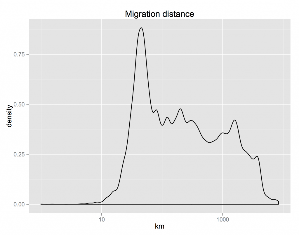
First, the distribution of the distance that people move is highly skewed. The median distance is about 500 km; the mean is almost 1000. Around 10% of movers don’t move more than 100 km; another 10% move more than 2500 km.

bydist

The differences between characteristics of the places where migrants are moving from and where they are moving to reveals an interesting fact: the US has approximate conservation of housing. The distribution of the ratio of incomes in the destination and origin counties is almost symmetric. For everyone who moves to a richer county, someone is abandoning that county for a poorer one. The same for the difference between the share of urban population in the destination and origin counties. These distributions are not perfectly symmetric though. On median, people move to counties 2.2% richer and 1.7% more urban.

byincome byurban

The urban share distribution tells us that most people move to a county that has about the same mix of rurality and urbanity as the one they came from. How does that stylized fact change depending on the backwardness of their origins?

urbancp-total

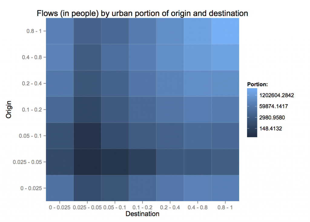
The flows in terms of people show the same symmetry as distribution. Note that the colors here are on a log scale, so the blue representing people moving from very rural areas to other very rural areas (lower left) is 0.4% of the light blue representing those moving from cities to cities. More patterns emerge when we condition on the flows coming out of each origin.

urbancp-normed

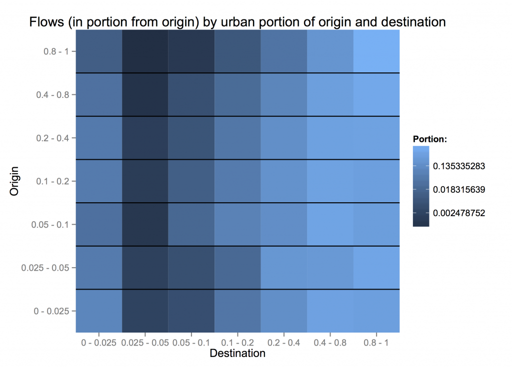
City dwellers are least willing to move to less-urban areas. However, people from completely rural counties (< 5% urban) are more likely to move to fully urban areas than those from 10 - 40% urban counties. How far are these people moving? Could the pattern of migrants' urbanization be a reflection of moving to nearby counties, which have fairly similar characteristics? urbandistcp

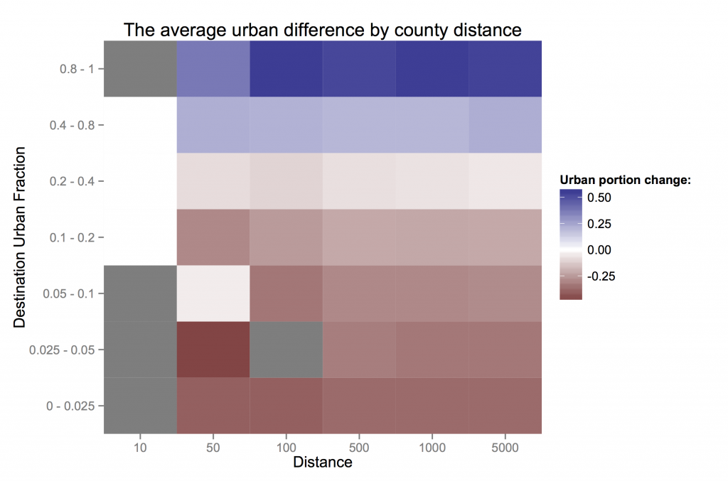
Just considering the pattern of counties (not their migrants) across different kinds degrees of urbanization, how similar are counties by distance? From the top row, on average, counties within 50 km of very urban counties are only slightly less urban, while those further out are much less urban. Counties near those with 20-40% urban populations are similar to their neighbors and to the national average. More rural areas tend to also be more rural than their neighbors.

What is surprising is that these facts are almost invariant across the distance considered. If anything, rural areas are *more* rural than their immediate neighbors than to counties further away.

So, at least in the US, even if people are inching their way spatially, they can quickly find themselves in the middle of a city. People don’t change the cultural characteristics of their surroundings (in terms of urbanization and income) much, but those it is again the suburbs that are stagnant, with rural people exchanging with big cities almost one-for-one.

The Society, Environment and Economics Lab

seel

I’d like to introduce SEEL, David Anthoff’s nascent lab within the Energy and Resources Group at UC Berkeley. What was initially a ramshackle group of Ph.D. students, associated with David for as little reason that economically minded folk in ERG’s engineering-focused community need to stick together, seems to be growing into a healthy researching machine. Check out the new website for the Society, Environment and Economics Lab.

The current drivers are around FUND, a widely-used integrated assessment model, maintained by David. For a long time, models like this have been black boxes, and FUND is one of the few with open source code. That’s changing with David’s new modeling framework, Mimi, which has allowed him to rewrite FUND as a collection of interconnected components.

I like the vision, and I think it’s implemented in a way that has real legs for shifting the climate impact assessment process into a more open process. But we’ll find out soon. The National Academy of Sciences is meeting soon to discuss the future of the “social cost of carbon”, an influential quantity computed by models like FUND. David is going to try to convince them that the future of impact modeling looks like Mimi. Godspeed.

Making your own duct tape wallet

Duct Tape wallets are cool, thin and light, and personalizable. The instructions below describe my design, which I think is elegant, and you can modify to your heart’s content.

Step 1.

Measure out the length of the two longest strips of duct tape:

Line four bills up, just touching along their long edges. Rip two
small strips of duct tape to measure an additional width to the left
and right of the four bills, or use credit cards, as shown below.

How to measure the backbone

Measuring the backbone


Step 2.

Measure out one strips of duct tape this length and lay it sticky-side-up.
Then measure a second strip and lay it stick-side-up with just
enough overlap to form a secure connection.

The backbone diagramThe backbone


Step 3.

Fold the strips into the basic wallet frame, by first folding them
in half, with the sticky-side out. Then continue folding in an
accordian fashion, only allowing the faces with the same letter
shown below to stick together. Make sure that these adhering faces
are smooth an even.

Folding faces Folding result

First fold
The first fold, in half, with a bill to measure the second fold.
Second fold
After the second fold.


Flip over
After the third fold and flipping over.
Final backbone
After the rest of the backbone folds.


Step 4.

Measure out a length of duct tape a little larger than twice the
width of the wallet and wrap it around the outside, with the
sticky-side covering the remaining stick-side of the wallet frame.

The wrapper diagram The wrapper


That’s it!  Enjoy your new wallet!

Final wallet

Axial Age: Sessions 0.5 – 1.5

Session 0.5:

Zaidu (Paul), a Mesopotamian army cleric, recently arrived in town looking for an escape from army life.
Vishnaya (Cat), a wandering Persian bard, was doing some entertainment by the new Zoroaster temple.

They both got knocked out and captured near a bottle merchant, accused of abducting a local prince (and generally making trouble in many places), and eventually released to be accompanied by a thug named Zoloft.

After getting plastered at a Haoma bar, they’re on their way to a job interview with the Babylonian deputy secretary for finance.

Session 1.5:

The session started with Vishnaya and Zaidu visiting the Minister of Coffer’s Deputy for Security (Parusiyati) at the palace. He asked them to travel to Cunaxa to figure out why tax requests had gone unanswered, and to take with them an overly curious traveler named Wu Tian. They were told they must leave the city now, and report to the guard when they return. They got a tablet to identify themselves in Cunaxa and another for the guard upon return.

On the way out of the palace, they were accosted by an certain Contrax, offering help and asking them to take a tablet to a noble in Cunaxa.

The group decided to take the overland route to Cunaxa, camping near a forest edge. During first watch, wolves attacked and began running off with bags. The group pursued until a rag-covered man arrived to help the wolves, leaving his last target, a trade wagon. The trade wagon had two passengers, one nearly dead and one injured and hiding. The injured one heard the commotion and went to help, promptly getting killed by the wolf-man. The group killed the rest of the wolves, but did not pursue the wolf-man.

After the battle, they found Karam, an African woman, covered in blood, completely looted, but conscious by the wagon.