Category Archives: Research

Extrapolating the 2017 Temperature

After NASA released the 2017 global average temperature, I started getting worried. 2017 wasn’t as hot as last year, but it was well above the trend.
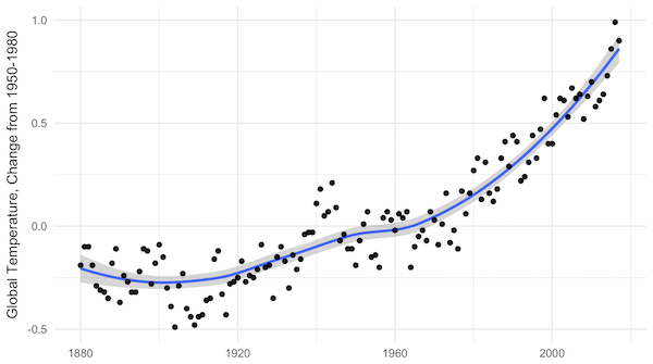

NASA yearly average temperatures and loess smoothed.

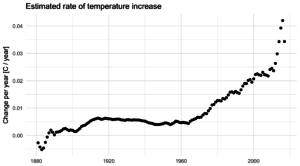
Three years above the trend is pretty common, but it makes you wonder: Do we know where the trend is? The convincing curve above is increasing at about 0.25°C per decade, but in the past 10 years, the temperature has increased by almost 0.5°C.

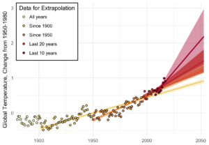
Depending on how far back you look, the more certain you are of the average trend, and the less certain of the recent trend. Back to 1900, we’ve been increasing at about 0.1°C per decade; in the past 20 years, about 0.2°C per decade; and an average of 0.4°C per decade in the past 10 years.

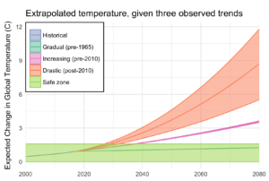
A little difference in the trend can make a big difference down the road. Take a look at where each of these get you, uncertainty included:

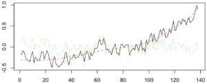
A big chunk of the fluctuations in temperature from year to year are actually predictable. They’re driven by cycles like ENSO and NAO. I used a nice data technique called “singular spectrum analysis” (SSA), which identifies the natural patterns in data by comparing a time-series to itself at all possible offsets. Then you can take extract the signal from the noise, as I do below. Black is the total timeseries, red is the main signal (the first two components of the SSA in this case), and green is the noise.

Once the noise is gone, we can look at what’s happening with the trend, on a year-by-year basis. Suddenly, the craziness of the past 5 years becomes clear:

It’s not just that the trend is higher. The trend is actually increasing, and fast! In 2010, temperatures were increasing at about 0.25°C per decade, an then that rate began to jump by almost 0.05°C per decade every year. The average from 2010 to 2017 is more like a trend that increases by 0.02°C per decade per year, but let’s look at where that takes us.

If that quadratic trend continues, we’ll blow through the “safe operating zone” of the Earth, the 2°C over pre-industrial temperatures, by 2030. Worse, by 2080, we risk a 9°C increase, with truly catastrophic consequences.

This is despite all of our recent efforts, securing an international agreement, ramping up renewable energy, and increasing energy efficiency. And therein lies the most worrying part of it all: if we are in a period of rapidly increasing temperatures, it might be because we have finally let the demon out, and the natural world is set to warm all on its own.
Crop categories

One thing that makes agriculture research difficult is the cornucopia of agricultural products. Globally, there are around 7,000 harvested species and innumerable subspecies, and even if 12 crops have come to dominate our food, it doesn’t stop 252 crops from being considered internationally important enough for the FAO to collect data on.

Source: Dimensions of Need: An atlas of food and agriculture, FAO, 1995

Source: Dimensions of Need: An atlas of food and agriculture, FAO, 1995

It takes 33 crop entries in the FAO database to account for 90% of global production, of which at 5 of those entries include multiple species.

Global production (MT), Source: FAO Statistics

Global production (MT), Source: FAO Statistics

Worse, different datasets collect information on different crops. Outside of the big three, there’s a Wild West of agriculture data to dissect. What’s a scientist to do?

The first step is to reduce the number of categories, to more than 2 (grains, other) and less than 252. By comparing the categories used by the FAO and the USDA, and also considering categories for major datasets I use, like the MIRCA2000 harvest areas and the Sacks crop calendar (and using a share of tag-sifting code to be a little objective), I came up with 10 categories:

  • Cereals (wheat and rice)
  • Coarse grains (not wheat and rice)
  • Oilcrops
  • Vegetables (including miscellaneous annuals)
  • Fruits (including miscellaneous perennials– plants that “bear fruit”)
  • Actives (spices, psychoactive plants)
  • Pulses
  • Tree nuts
  • Materials (and decoratives)
  • Feed

You can download the crop-by-crop (and other dataset category) mapping, currently as a PDF: A Crop Taxonomy

Still, most of these categories admit further division: fruits into melons, citrus, and non-citrus; splitting out the subcategory of caffeinated drinks from the actives category. What we need is a treemap for a cropmap! The best-looking maps I could make were using the R treemap package, shown below with rectangles sized by their global harvest area.

treemap

You can click through a more interactive version, using Google’s treemap library.

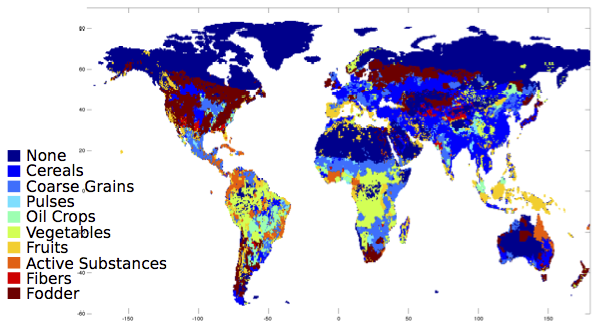
What does the world look like, with these categories? Here, it is colored by which category the majority production crop falls into:

majorities

And since that looks rather cereal-dominated to my taste, here it is just considering fruits and vegetables:

fruitveggie

For now, I will leave the interpretation of these fascinating maps to my readers.

Google Scholar Alerts to RSS: A punctuated equilibrium

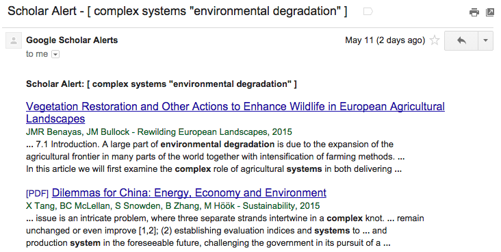
If you’re like me, you have a pile of Google Scholar Alerts that you never manage to read. It’s a reflection of a more general problem: how do you find good articles, when there are so many articles to sift through?

I’ve recently started using Sux0r, a Bayesian filtering RSS feed reader. However, Google Scholar sends alerts to one’s email, and we’ll want to extract each paper as a separate RSS item.

alertemail

Here’s my process, and the steps for doing it yourself:

Google Scholar Alerts → IFTTT → Blogger → Perl → DreamHost → RSS → Bayesian Reader

  1. Create a Blogger blog that you will just use for Google Scholar Alerts: Go to the Blogger Home Page and follow the steps under “New Blog”.
  2. Sign up for IFTTT (if you don’t already have an account), and create a new recipe to post emails from scholaralerts-noreply@google.com to your new blog. The channel for the trigger is your email system (Gmail for me); the trigger is “New email in inbox from…”; the channel for the action is Blogger; and the title and labels can be whatever you want as along as the body is “{{BodyPlain}}” (which includes HTML).

    ifttttrigger

  3. Modify the Perl code below, pointing it to the front page of your new Blogger blog. It will return an RSS feed when called at the command line (perl scholar.pl).

    rssfeed

  4. Upload the Perl script to your favorite server (mine, http://existencia.org/, is powered by DreamHost.
  5. Point your favorite RSS reader to the URL of the Perl script as an RSS feed, and wait as the Google Alerts come streaming in!

Here is the code for the Alert-Blogger-to-RSS Perl script. All you need to do is fill in the $url line below.

#!/usr/bin/perl -w
use strict;
use CGI qw(:standard);

use XML::RSS; # Library for RSS generation
use LWP::Simple; # Library for web access

# Download the first page from the blog
my $url = "http://mygooglealerts.blogspot.com/"; ### <-- FILL IN HERE!
my $input = get($url);
my @lines = split /\n/, $input;

# Set up the RSS feed we will fill
my $rss = new XML::RSS(version => '2.0');
$rss->channel(title => "Google Scholar Alerts");

# Iterate through the lines of HTML
my $ii = 0;
while ($ii < $#lines) {
    my $line = $lines[$ii];
    # Look for a <h3> starting the entry
    if ($line !~ /^<h3 style="font-weight:normal/) {
        $ii = ++$ii;
        next;
    }

    # Extract the title and link
    $line =~ /<a href="([^"]+)"><font .*?>(.+)<\/font>/;
    my $title = $2;
    my $link = $1;

    # Extract the authors and publication information
    my $line2 = $lines[$ii+1];
    $line2 =~ /<div><font .+?>([^<]+?) - (.*?, )?(\d{4})/;
    my $authors = $1;
    my $journal = (defined $2) ? $2 : '';
    my $year = $3;

    # Extract the snippets
    my $line3 = $lines[$ii+2];
    $line3 =~ /<div><font .+?>(.+?)<br \/>/;
    my $content = $1;
    for ($ii = $ii + 3; $ii < @lines; $ii++) {
        my $linen = $lines[$ii];
        # Are we done, or is there another line of snippets?
        if ($linen =~ /^(.+?)<\/font><\/div>/) {
            $content = $content . '<br />' . $1;
            last;
        } else {
            $linen =~ /^(.+?)<br \/>/;
            $content = $content . '<br />' . $1;
        }
    }
    $ii = ++$ii;

    # Use the title and publication for the RSS entry title
    my $longtitle = "$title ($authors, $journal $year)";

    # Add it to the RSS feed
    $rss->add_item(title => $longtitle,
                   link => $link,
                   description => $content);
        
    $ii = ++$ii;
}

# Write out the RSS feed
print header('application/xml+rss');
print $rss->as_string;

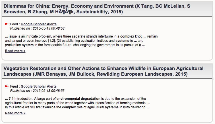
In Sux0r, here are a couple of items form the final result:

sux0rfeed

SSA and NINO

NINO 3 is a measure of El Niño/La Niña (ENSO) intensity. It’s often said that ENSO has a period of 3-7 years. Why is it so hard to identify a single period? This is a job for SSA!

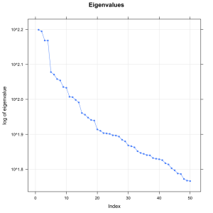
ninoscree

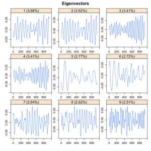
The scree plot shows that there are a ton of significant eigenvectors– this is a very complicated signal– but I want to focus on the first four, which are a shade more significant than the rest. They come in two pairs, which for SSA means that they represent two sinusoids. Here are the eigenvectors.

ninovects

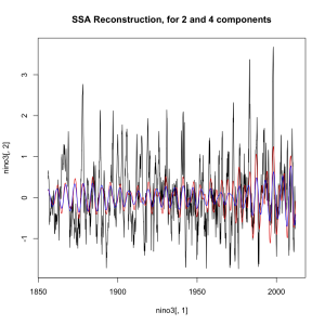
How well do these two capture the ENSO signal?

ninossar

Not great, but it gets most of the ups and downs. Just not the peaks.

So what are the periods of these two? The first two are at 5.8 years, and the second two at 3.5 years. To note: those are relatively prime, so the two frequencies are always going to be going in and out of sync. So it’s not so much that ENSO has a clear frequency (it doesn’t), nor that that frequency is 3-7 years (because what would that mean anyway). It has two main frequencies, like a dial tone.

Chasing Fish

For the EI retreat recently, for one of three short videos I generated for my presentation, I converted my code for the “Distributed Fishery Commons”, an simple ABM, to 2-D. Each dot in the video is a virtual boat, fishing down a path in its wake. The boats never directly interact, other than to not fish at the same location. They just move to where they see the most fish, and the result is an intricate dance or bouncing around. Take a look:

Science 2.0

Science is constantly changing– we’re generating new data and developing new models faster than we can understand how they should all fit together.

My tool, the Distributed Meta-Analysis System, is ready to go, and I want to write more about it. But I also want to point people to two other interesting projects that seem to be trying to make science work better:

The Open Science Framework is trying to get people to make their data and papers and science, in general, available for all.

Curate Science is trying to solve the replication problem, encourage people to post their replication results and identifying needs.

For me, this is also about what might be called “Evolutionary Modeling”: modeling as a social and ongoing endeavor, involving many groups and combining their results in institutional ways. Science 2.0 is coming.

Impulse Responses To ENSO

El Nino and La Nina affects crops in a lot of different ways.  I’ve been looking at the response of agricultural yields over time to an ENSO event, where, depending on the dynamics of the social-natural system, impacts could persist for years after the impact or even emerge before the impact.

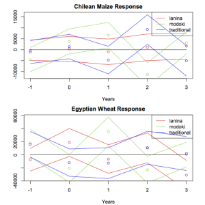
Here’s what country-wide production look like, in this impulse response framework.  Neither Chile nor Egypt show a response to La Nina, but they both have strong responses (which appear to oscillate) to Modoki El Ninos.

country-response

The map below shows areas where Maize is grown (anywhere but black).  Areas in white show no significant response from ENSO.  Colored areas deviate from grey in three bands: red for a response to traditional El Ninos, green for a response to Modoki El Ninos, and blue for La Ninas.

yieldcorr