Tag Archives: James Rising

Crop categories

One thing that makes agriculture research difficult is the cornucopia of agricultural products. Globally, there are around 7,000 harvested species and innumerable subspecies, and even if 12 crops have come to dominate our food, it doesn’t stop 252 crops from being considered internationally important enough for the FAO to collect data on.

Source: Dimensions of Need: An atlas of food and agriculture, FAO, 1995

Source: Dimensions of Need: An atlas of food and agriculture, FAO, 1995

It takes 33 crop entries in the FAO database to account for 90% of global production, of which at 5 of those entries include multiple species.

Global production (MT), Source: FAO Statistics

Global production (MT), Source: FAO Statistics

Worse, different datasets collect information on different crops. Outside of the big three, there’s a Wild West of agriculture data to dissect. What’s a scientist to do?

The first step is to reduce the number of categories, to more than 2 (grains, other) and less than 252. By comparing the categories used by the FAO and the USDA, and also considering categories for major datasets I use, like the MIRCA2000 harvest areas and the Sacks crop calendar (and using a share of tag-sifting code to be a little objective), I came up with 10 categories:

  • Cereals (wheat and rice)
  • Coarse grains (not wheat and rice)
  • Oilcrops
  • Vegetables (including miscellaneous annuals)
  • Fruits (including miscellaneous perennials– plants that “bear fruit”)
  • Actives (spices, psychoactive plants)
  • Pulses
  • Tree nuts
  • Materials (and decoratives)
  • Feed

You can download the crop-by-crop (and other dataset category) mapping, currently as a PDF: A Crop Taxonomy

Still, most of these categories admit further division: fruits into melons, citrus, and non-citrus; splitting out the subcategory of caffeinated drinks from the actives category. What we need is a treemap for a cropmap! The best-looking maps I could make were using the R treemap package, shown below with rectangles sized by their global harvest area.

treemap

You can click through a more interactive version, using Google’s treemap library.

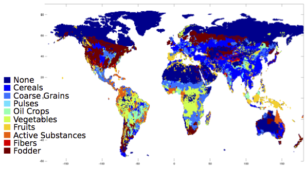
What does the world look like, with these categories? Here, it is colored by which category the majority production crop falls into:

majorities

And since that looks rather cereal-dominated to my taste, here it is just considering fruits and vegetables:

fruitveggie

For now, I will leave the interpretation of these fascinating maps to my readers.

Economic Risks of Climate Change Book out tomorrow!

The research behind the Risky Business report will be released as a fully remastered book, tomorrow, August 11!  This was a huge collaborative effort, led by Trevor Houser, Solomon Hsiang, and Robert Kopp, and coauthored with nine others, including me:

Economic Risks of Climate Change

From the publisher’s website:

Climate change threatens the economy of the United States in myriad ways, including increased flooding and storm damage, altered crop yields, lost labor productivity, higher crime, reshaped public-health patterns, and strained energy systems, among many other effects. Combining the latest climate models, state-of-the-art econometric research on human responses to climate, and cutting-edge private-sector risk-assessment tools, Economic Risks of Climate Change: An American Prospectus crafts a game-changing profile of the economic risks of climate change in the United States.

The book combines an exciting new approach to solidly ground results in data with an extensive overview of the world of climate change impacts. Take a look!

Guest Post: The trouble with anticipation (Nate Neligh)

Hello everyone, I am here to do a little guest blogging today. Instead of some useful empirical tools or interesting analysis, I want to take you on a short tour through of the murkier aspects of economic theory: anticipation. The very idea of the ubiquitous Nash Equilibrium is rooted in anticipation. Much of behavioral economics is focused on determining how people anticipate one another’s actions. While economists have a pretty decent handle on how people will anticipate and act in repeated games (the same game played over and over) and small games with a few different decisions, not as much work has been put into studying long games with complex history dependence. To use an analogy, economists have done a lot of work on games that look like poker but much less work on games that look like chess.

One of the fundamental problems is finding a long form game that has enough mathematical coherence and deep structure to allow the game to be solved analytically. Economists like analytical solutions when they are available, but it is rare to find an interesting game that can be solved by pen and paper.

Brute force simulation can be helpful. Simply simulating all possible outcomes and using a technique called backwards induction, we can solve the game in a Nash Equilibrium sense, but this approach has drawbacks. First, the technique is limited. Even with a wonderful computer and a lot of time, there are some games that simply cannot be solved in human time due to their complexity. More importantly, any solutions that are derived are not realistic. The average person does not have the ability to perform the same computations as a super computer. On the other hand, people are not as simple as the mechanical actions of a physics inspired model.

James and I have been working on a game of strategic network formation which effectively illustrates all these problems. The model takes 2 parameters (the number of nodes and the cost of making new connections) and uses them to strategically construct a network in a decentralized way. The rules are extremely simple and almost completely linear, but the complexities of backwards induction make it impossible to solve by hand for a network of any significant size (some modifications can be added which shrink the state space to the point where the game can be solved). Backwards induction doesn’t work for large networks, since the number of possible outcomes grows at a rate of (roughly) but what we can see is intriguing. The results seem to follow a pattern, but they are not predictable.

The trouble with anticipation


Each region of a different color represents a different network (colors selected based on network properties). The y-axis is discrete number of nudes in the network. The x axis is a continuous cost parameter. Compare where the color changes as the cost parameter is varied across the different numbers of nodes. As you can see, switch points tend to be somewhat similar across network scales, but they are not completely consistent.

Currently we are exploring a number of options; I personally think that agent-based modeling is going to be the key to tackling this type of problem (and those that are even less tractable) in the future. Agent based models and genetic algorithms have the potential to be more realistic and more tractable than any more traditional solution.

Google Scholar Alerts to RSS: A punctuated equilibrium

If you’re like me, you have a pile of Google Scholar Alerts that you never manage to read. It’s a reflection of a more general problem: how do you find good articles, when there are so many articles to sift through?

I’ve recently started using Sux0r, a Bayesian filtering RSS feed reader. However, Google Scholar sends alerts to one’s email, and we’ll want to extract each paper as a separate RSS item.

alertemail

Here’s my process, and the steps for doing it yourself:

Google Scholar Alerts → IFTTT → Blogger → Perl → DreamHost → RSS → Bayesian Reader

  1. Create a Blogger blog that you will just use for Google Scholar Alerts: Go to the Blogger Home Page and follow the steps under “New Blog”.
  2. Sign up for IFTTT (if you don’t already have an account), and create a new recipe to post emails from scholaralerts-noreply@google.com to your new blog. The channel for the trigger is your email system (Gmail for me); the trigger is “New email in inbox from…”; the channel for the action is Blogger; and the title and labels can be whatever you want as along as the body is “{{BodyPlain}}” (which includes HTML).

    ifttttrigger

  3. Modify the Perl code below, pointing it to the front page of your new Blogger blog. It will return an RSS feed when called at the command line (perl scholar.pl).

    rssfeed

  4. Upload the Perl script to your favorite server (mine, http://existencia.org/, is powered by DreamHost.
  5. Point your favorite RSS reader to the URL of the Perl script as an RSS feed, and wait as the Google Alerts come streaming in!

Here is the code for the Alert-Blogger-to-RSS Perl script. All you need to do is fill in the $url line below.

#!/usr/bin/perl -w
use strict;
use CGI qw(:standard);

use XML::RSS; # Library for RSS generation
use LWP::Simple; # Library for web access

# Download the first page from the blog
my $url = "http://mygooglealerts.blogspot.com/"; ### <-- FILL IN HERE!
my $input = get($url);
my @lines = split /\n/, $input;

# Set up the RSS feed we will fill
my $rss = new XML::RSS(version => '2.0');
$rss->channel(title => "Google Scholar Alerts");

# Iterate through the lines of HTML
my $ii = 0;
while ($ii < $#lines) {
    my $line = $lines[$ii];
    # Look for a <h3> starting the entry
    if ($line !~ /^<h3 style="font-weight:normal/) {
        $ii = ++$ii;
        next;
    }

    # Extract the title and link
    $line =~ /<a href="([^"]+)"><font .*?>(.+)<\/font>/;
    my $title = $2;
    my $link = $1;

    # Extract the authors and publication information
    my $line2 = $lines[$ii+1];
    $line2 =~ /<div><font .+?>([^<]+?) - (.*?, )?(\d{4})/;
    my $authors = $1;
    my $journal = (defined $2) ? $2 : '';
    my $year = $3;

    # Extract the snippets
    my $line3 = $lines[$ii+2];
    $line3 =~ /<div><font .+?>(.+?)<br \/>/;
    my $content = $1;
    for ($ii = $ii + 3; $ii < @lines; $ii++) {
        my $linen = $lines[$ii];
        # Are we done, or is there another line of snippets?
        if ($linen =~ /^(.+?)<\/font><\/div>/) {
            $content = $content . '<br />' . $1;
            last;
        } else {
            $linen =~ /^(.+?)<br \/>/;
            $content = $content . '<br />' . $1;
        }
    }
    $ii = ++$ii;

    # Use the title and publication for the RSS entry title
    my $longtitle = "$title ($authors, $journal $year)";

    # Add it to the RSS feed
    $rss->add_item(title => $longtitle,
                   link => $link,
                   description => $content);
        
    $ii = ++$ii;
}

# Write out the RSS feed
print header('application/xml+rss');
print $rss->as_string;

In Sux0r, here are a couple of items form the final result:

sux0rfeed

Scripts for Twitter Data

Twitter data– the endless stream of tweets, the user network, and the rise and fall of hashtags– offers a flood of insight into the minute-by-minute state of the society. Or at least one self-selecting part of it. A lot of people want to use it for research, and it turns out to be pretty easy to do so.

You can either purchase twitter data, or collect it in real-time. If you purchase twitter data, it’s all organized for you and available historically, but it basically isn’t anything that you can’t get yourself by monitoring twitter in real-time. I’ve used GNIP, where the going rate was about $500 per million tweets in 2013.

There are two main ways to collect data directly from twitter: “queries” and the “stream”. Queries let you get up to 1000 tweets at any point in time– whichever the most recent tweets that match your search criteria. The stream gives you a fraction of a percent of tweets continuously, which very quickly adds up, based on filtering criteria.

Scripts for doing these two options are below, but you need to decide on the search/streaming criteria. Typically, these are search terms and geographical constraints. See Twitter’s API documentation to decide on your search options.

Twitter uses an athentication system to identify both the individual collecting the data, and what tool is helping them do it. It is easy to register a new tool, whereby you pretend that you’re a startup with a great new app. Here are the steps:

  1. Install python’s twitter package, using “easy_install twitter” or “pip install twitter”.
  2. Create an app at http://ift.tt/1oHSTpv. Leave the callback URL blank, but fill in the rest.
  3. Set the CONSUMER_KEY and CONSUMER_SECRET in the code below to the values you get on the keys and access tokens tab of your app.
  4. Fill in the name of the application.
  5. Fill in any search terms or structured searches you like.
  6. If you’re using the downloaded scripts, which output data to a CSV file, change where the file is written, to some directory (where it says “twitter/us_”).
  7. Run the script from your computer’s terminal (i.e., python search.py)
  8. The script will pop up a browser for you to log into twitter and accept permissions from your app.
  9. Get data.

Here is what a simple script looks like:

import os, twitter

APP_NAME = "Your app name"
CONSUMER_KEY = 'Your consumer key'
CONSUMER_SECRET = 'Your consumer token'

# Do we already have a token saved?
MY_TWITTER_CREDS = os.path.expanduser('~/.class_credentials')
if not os.path.exists(MY_TWITTER_CREDS):
    # This will ask you to accept the permissions and save the token
    twitter.oauth_dance(APP_NAME, CONSUMER_KEY, CONSUMER_SECRET,
                        MY_TWITTER_CREDS)

# Read the token
oauth_token, oauth_secret = twitter.read_token_file(MY_TWITTER_CREDS)

# Open up an API object, with the OAuth token
api = twitter.Twitter(api_version="1.1", auth=twitter.OAuth(oauth_token, oauth_secret, CONSUMER_KEY, CONSUMER_SECRET))

# Perform our query
tweets = api.search.tweets(q="risky business")

# Print the results
for tweet in tweets['statuses']:
    if not 'text' in tweet:
        continue

    print tweet
    break

For automating twitter collection, I’ve put together scripts for queries (search.py), streaming (filter.py), and bash scripts that run them repeatedly (repsearch.sh and repfilter.sh). Download the scripts.

To use the repetition scripts, make the repetition scripts executable by running “chmod a+x repsearch.sh repfilter.sh“. Then run them, by typing ./repfilter.sh or ./repsearch.sh. Note that these will create many many files over time, which you’ll have to merge together.

US Water Network

The America’s Water project, coordinated at Columbia’s Water Center by Upmanu Lall, is trying to understand the US water system as an integrated whole, and understand how that system will evolve over the next decades. Doing so will require a comprehensive model, incorporating agriculture, energy, cities, policy, and more.

We are just beginning to lay the foundation for that model. A first step is to create a network of links between station gauges around the US, representing upstream and downstream flows and counties served. The ultimate form of that model will rely on physical flow data, but I created a first pass using simple rules:

  1. Every gauge can only be connected to one downstream gauge (but not visa versa).
  2. Upstream gauges must be at a higher elevation than downstream gauges.
  3. Upstream gauges must be fed by a smaller drainage basin than downstream gauges.
  4. Of the gauges that satisfy the first two constraints, the chosen downstream gauge is the one with the shortest distance and the most “plausible” streamflow.

The full description is available on Overleaf. I’ve applied the algorithm to the GAGES II database from USGSU, which includes all station gauges with at least 20 years of data.

network3

Every red dot is a gauge, black lines are upstream-downstream connections between gauges, and the blue and green lines connect counties with each of the gauges by similar rules to the ones above (green edges if the link is forced to be longer than 100 km).

This kind of network opens the door for a lot of interesting analyses. For example, if agricultural withdrawals increase in the midwest, how much less water will be available downstream? We’re working now to construct a full optimization model that accounts for upstream dependencies.

Another simple question is, how much of the demand in each county is satisfied by flows available to it? Here are the results, and many cities show up in sharp red, showing that their demands exceed the surface water by 10 times or more.

supplydemand-surface

Negative result: country-wide growing degree-days

I put this here as a warning. While growing degree-days (GDD) are well-known as an effective model to predict yields, they don’t perform so hot at the country-scale.

I used mean temperature GDDs, between 8 and 24 degrees C, estimated at many locations from station data, and then using the weighted average by production within each country. Here are the results:

Statistical models
Barley Maize Millet Rice Sorghum Wheat
GDD / 1000 -0.03 0.01 -0.07** 0.08 0.04* -0.08***
(0.01) (0.01) (0.03) (0.06) (0.02) (0.02)
Precip. (m) 0.09 0.11*** 0.12* 0.02 0.14*** -0.04
(0.05) (0.03) (0.05) (0.03) (0.04) (0.04)
Country Cubic Y Y Y Y Y Y
R2 0.95 0.97 0.91 0.97 0.92 0.96
Adj. R2 0.94 0.96 0.90 0.97 0.91 0.95
Num. obs. 1639 3595 1516 1721 2300 1791
***p < 0.001, **p < 0.01, *p < 0.05

As you can see, for most crops, these GDDs aren’t even significant, and as frequently negative as positive. This defies a century of agricultural research, but the same data at a fine spatial scale seems to work just fine.

Growing Degree-Day Calculations

Schlenker and Roberts (2009) use daily minimum and maximum temperatures to calculate growing degrees, rather than daily mean temperatures. This is important when the effect of extreme temperatures is an issue, since these often will not show up in mean temperatures.

Growing degree days form a useful model of crop productivity. DMAS has examples of these for maize, soybeans, and cotton.

To do this, they use a sinusoidal approximation, integrating the area of a curve through the minimum and maximum temperatures:
thresholds
(adapted from here– but don’t use their calculations!)

The calculations aren’t very difficult, but require some careful math. I had a need to write them in python and translate them to R, so I’m providing them here for anyone’s benefit.

import numpy as np
import warnings

warnings.simplefilter("ignore", RuntimeWarning)

def above_threshold(mins, maxs, threshold):
    """Use a sinusoidal approximation to estimate the number of Growing
Degree-Days above a given threshold, using daily minimum and maximum
temperatures.

mins and maxs are numpy arrays; threshold is in the same units."""

    # Determine crossing points, as a fraction of the day
    plus_over_2 = (mins + maxs)/2
    minus_over_2 = (maxs - mins)/2
    two_pi = 2*np.pi
    # d0s is the times of crossing above; d1s is when cross below
    d0s = np.arcsin((threshold - plus_over_2) / minus_over_2) / two_pi
    d1s = .5 - d0s

    # If always above or below threshold, set crossings accordingly
    aboves = mins >= threshold
    belows = maxs <= threshold

    d0s[aboves] = 0
    d1s[aboves] = 1
    d0s[belows] = 0
    d1s[belows] = 0

    # Calculate integral
    F1s = -minus_over_2 * np.cos(2*np.pi*d1s) / two_pi + plus_over_2 * d1s
    F0s = -minus_over_2 * np.cos(2*np.pi*d0s) / two_pi + plus_over_2 * d0s
    return np.sum(F1s - F0s - threshold * (d1s - d0s))

def get_gddkdd(mins, maxs, gdd_start, kdd_start):
    """Get the Growing Degree-Days, as degree-days between gdd_start and
kdd_start, and Killing Degree-Days, as the degree-days above
kdd_start.

mins and maxs are numpy arrays; threshold is in the same units."""

    dd_lowup = above_threshold(mins, maxs, gdd_start)
    dd_above = above_threshold(mins, maxs, kdd_start)
    dd_lower = dd_lowup - dd_above

    return (dd_lower, dd_above)

Download the code for R or python.

Integrated Food System Speed Talk

Below is my Prezi presentation, from a 4 minute “speed talk” on my research a week ago:

The main points of the narrative are below:

  1. Frame 1: My pre-thesis research:
    • I’m going to give a brief sense of where my research has gone, and my hopes for where it’s going.
    • My research has evolved– or wandered– but I’ve realized that it centers around food.
    • Food represents some of the most important ways humanity both relies upon and impacts the planet.
    • We need better models to understand this relationship– models that are sensitive to changing environmental conditions (including climate), and changing management (including adaptation).
  2. Frame 2: My thesis:
    • Perhaps more importantly, we need models powerful enough to capture feedbacks.
    • Harvests feedback and affect the harvesters: Fluctuations in a harvest affect producers in immediate and long-term ways.
    • Producers aren’t mechanical or linear: they respond dynamically to conditions.
    • Producers are part of the system, and I’m interested in understanding these systems as wholes.
  3. Frame 3: The greater whole:
    • These feedback loops are part of a larger integrated system of how food works.
    • Example: When farmers use excessive inputs in the course of their management, it impacts the environment, including that of fishers.
    • Example: 1/3 of fish caught is sold as fishmeal, which goes to feed livestock. These are all connected.
  4. Frame 4: What we eat becomes a driving force throughout this integrated system.
  5. Frame 5: A call for help:
    • Consumption patterns feed back on the production system, which feeds back on large environmental processes like climate change.
    • We need integrated models with all these parts to understand the whole and find leverage points where policies can make a difference.
    • I’d like to invite people from many fields to help out: biologists, computer scientists, economists, and foodies too.
    • Help me better represent the vast opportunities the food system holds for a sustainable future.

The Distribution of Possible Climates

There’s a lot we don’t know about future climates. Despite continuous improvements, our models still do notoriously poorly with some fairly fundamental dynamics: ocean energy transport, the Indian monsoon, and just reproducing past climate. Worse, we have the computing resources to run each model a hand-full of times. We haven’t estimated the distribution of possible temperatures that even one model predicts.

Instead, we treat the range of models as a kind of distribution over beliefs. This is useful, but a poor approximation to an actual distribution. For one, most of the models are incestuously related. Climate is chaotic, no matter how you model it, so changing the inputs within measurement error can produce a whole range of future temperatures.

This is all motivation for a big innovation from the Risky Business report, on the part of Bob Kopp and DJ Rasmussen.

First, they collected the full range of 44 CMIP5 models (downscaled and adjusted to predict every US county). They extracted each one’s global 2080-2099 temperature prediction.

Then they ran an *hemisphere* scale model (MAGICC), for which its possible to compute enough runs to produce a whole distribution of future temperatures.

Here’s the result: a matching between models and the temperatures distribution for end-of-century global temperatures.

magicc-cmip5

[From American Climate Prospectus, Technical Appendix I: Physical Climate Projections]

The opaque maps are each the output of a different GCM. The ghosted maps aren’t– at least, not alone. In fact, every ghosted map represents a portion of the probability distribution which is currently missing from our models.

To fix this, they made “surrogate” models, by decomposing existing GCM outputs into “forced” seasonal patterns which scale with temperature, and unforced variability. Then they scaled up the forced pattern, added back in the variability, and bingo! A new surrogate model.

Surrogates can’t tell us the true horrors of a high-temperature world, but without them we’d be navigating without a tail.